
According to GitHub’s statistics in 2020, over 60 million new repositories were added, and more than 56 million developers worked on OpenSource projects. By 2025, the number of developers working on OpenSource projects on GitHub is expected to exceed 100 million.
Behind these fast-growing numbers, open source maintainers did a lot of work on propaganda, article, media, Meetups, etc., to attract more developers for their projects, It’s a lot to take in.
So for developers, how can they find out which one is the best fit for their company among the hundreds of projects on GitHub?
Various indicators of open source projects needs to be considered.
Star number: This is the most direct indicator, it represents the project has attracted the attention of a number of developers, can reflect the level of marketing of the project. If the project has the financial support of commercial companies, a strong PR team, or a water army to paint Star, then this indicator can easily be distorted.
Issue and PR counts: Also GitHub provides the Insights feature, shown in the following image.
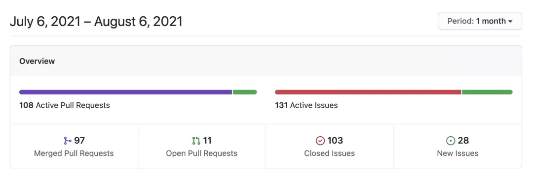
You can select the number of new and closed issues and PRs for this open source project, can also filter by period.
The above graph shows the data of Apache APISIX for the last month.
GitHub insights provides a great developer perspective, but it’s not perfect: what about the quality of Issue and PR?
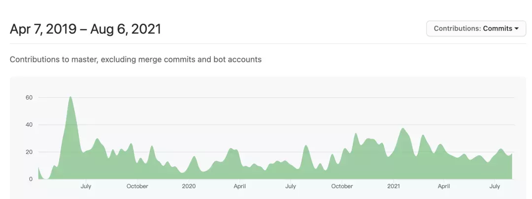
The following graph shows the commit frequency statistics of Apache APISIX from it’s first day, which shows that Apache APISIX has maintained a very stable and continuous activities, but this metric is also a bit thin: you can’t see the data of which developers submitted these commits

after reading so many indicators, still you can’t get your answer, don’t you think that choosing an open source project is so complicated? Wait!
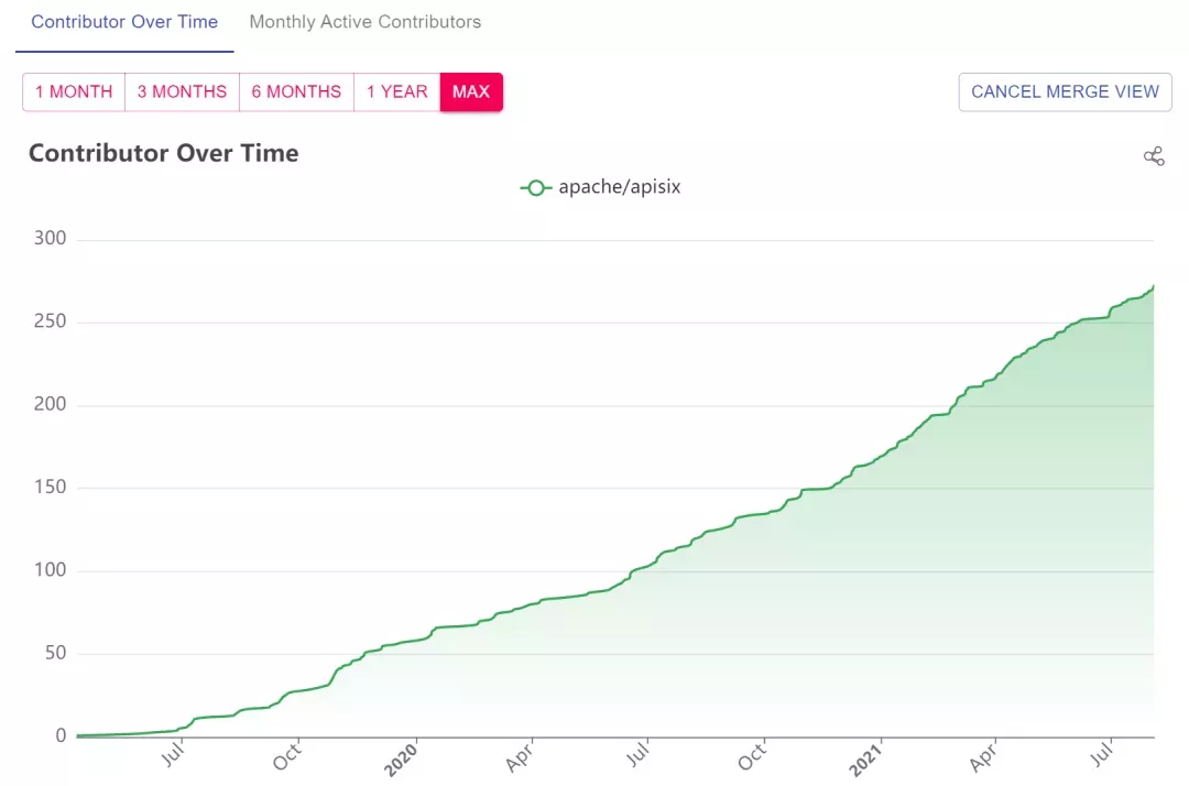
Is there a “golden metric”, a metric that cannot be mocked by marketing? A core metric that can tell the truth of a project? As maintainers and developers of open source projects, we also need such golden metrics to guide us. Therefore, we propose two dimensions, “Contributor Growth” and “Active Contributors”, and open source the statistics and analysis process: https://github.com/api7/contributor-graph, you can also search directly through https://www.apiseven.com/zh/contributor-graph. Here is an example from Apache APISIX.
Contributor growth
Monthly Active Contributors
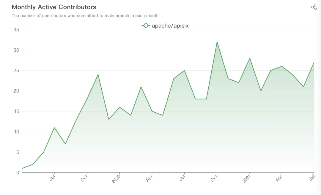

As you can clearly see from the two tables above, Apache APISIX has seen a steady growth in contributors since its first day, with about 25 contributors participating each month.
Comparison on Multi Repo
Both the “Contributor Growth” and “Active Contributors” charts support comparisons across multiple repositories. What’s more, we pull the GitHub API to update the charts on a daily/monthly basis, so your repository can always display real-time contributor data by making a one-time copy using the link we provide.
The contributor growth line plot is based on the date of the first commit by each contributor to the project. The contributor growth line chart allows us to see the growth of the community based on the total number of contributors shown on the GitHub homepage.
By showing line plot for multiple repo in the same chart at the same time, we can also visually compare the development of different communities.
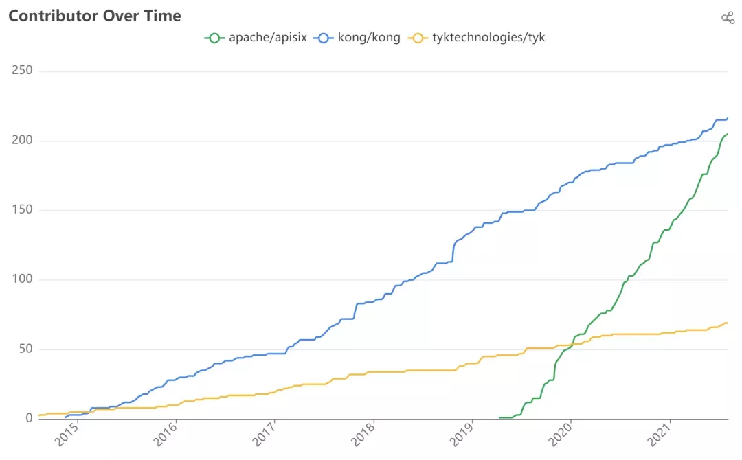

In the graph above, we can see that the number of contributors to Apache APISIX is growing at a very fast rate, and in just two years, the number of contributors has almost caught up with or even surpassed other open source API gateway projects.
The monthly contributor line plot is derived from the number of contributors committing each month.
Compared to the contributor growth line plot, the monthly contributors are a better measure of how the community has grown in a short period of time.
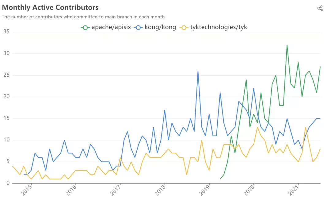

For example, in the graph above, we can see that Apache APISIX has the highest and most consistent number of monthly contributors of any open source API gateway project.
This explains why Apache APISIX has been able to catch up with its friends in terms of total contributors in such a short period of time since it’s first day of open source.
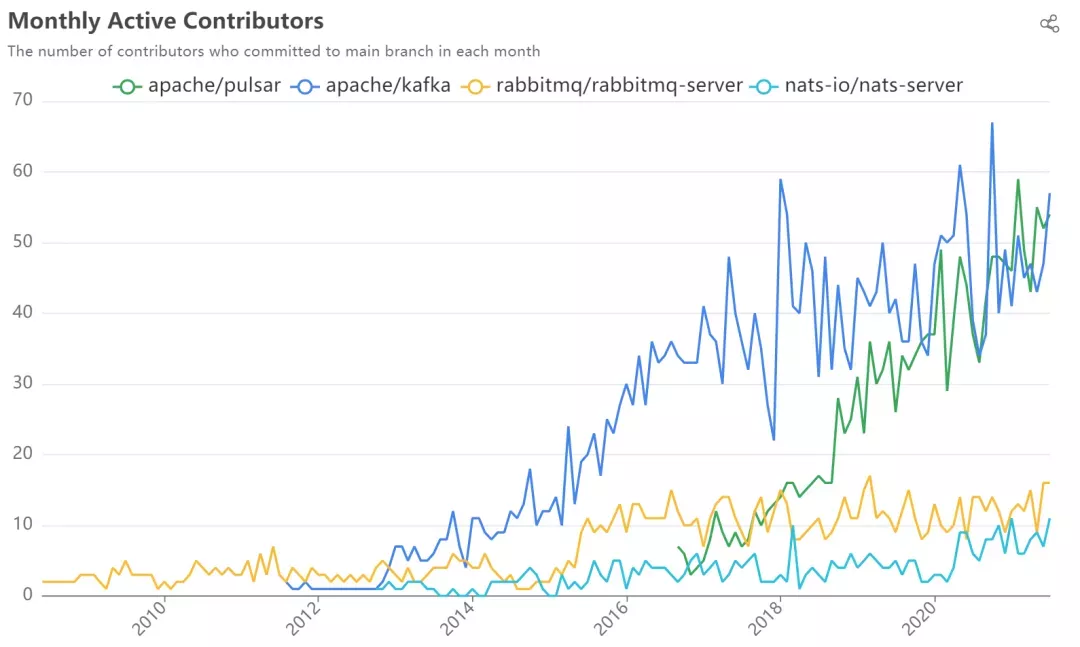

The above graph is comparison of monthly contributors between different MQ community, which is also widely discussed on Twitter. With this chart, we can see that Apache Pulsar is catching up to Apache Kafka in terms of contributors of the month.
Conclusion
The contributor graph is currently used in Apache APISIX, Apache Skywalking, Apache DolphinScheduler, Apache Openwhisk, Apache ShardingSphere, awesome-docker, TiDB docs-dm, and many other open source projects.
Also, we implemented more features, such as adding “anonymous” contributors, or adding SVN-side contributors after the project was moved from SVN to GitHub.
When we talked about the Contributor Graph, not only did we want to use this tool to produce a visual graph of how active the Apache APISIX community is, we also made this little tool open sourced in the hopes that it will help other open source projects.
You are welcome to use the Contributor Graph to track your community activity, and any requests or questions are welcome in the Contributor Graph GitHub repository.
You can visit the Contributor Graph repository.